Website Redesign: What are the critical screen resolutions ?
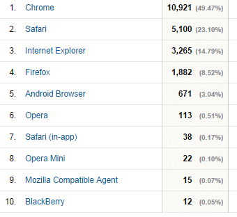
In Part 2, Which Browsers to Target?, we reviewed the targeted browsers and version using Google Analytics
In this part, we evaluate using same period of Google Analytics data.
We sort from most common to less common, guestimate the user profile and their trend [ex: iPhone6 already in the stat but growing fast] and finally put priorities based on % + trend.
More difficult then it seems since some report physical resolutions, some report CSS type resolution, etc.
The reason to not only use % but also estimated user profile and trend is to ensure our web site update will actual target our critical customers [we have both B2B thus must consider "old" corporate computers used by buyer/admin; and B2C thus must consider latest mobiles] not only now but at least for the next 12 months.
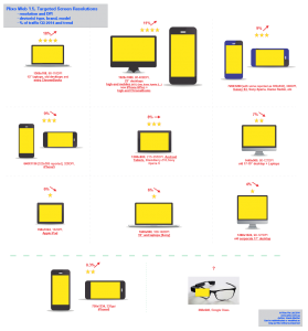
We group and organize them in a limited, manageable number of screen resolution, and put them in a more visual infographic with portrait/landscape actual size when suitable that we will use later to do our Responsive Web Design with the critical size breaks.
Responsive Web Design : Screen Resolution Target Infographic
Next Episode: drafting Responsive Web Design for the critical screen resolution…

